adweek called it a travesty. what you learn from that?: i knew going in that it be a difficult change. there's not a single company i've seen, whether they are starbucks or gap that is changed their logo and it has been easy. there is not a single company. i think the question is how much work to do you put to it before you get there? how much resolved you have? do you have the right reasons? you want to give people the idea that were not just about photography, we were more general than that. we were about creativity, thus the colors and simplicity. we wanted something that would scale across different mediums. it will great on a phone, t-shirt, billboard and wears anywhere. as much as i love the original one, it wouldn't do that. the current one i didn't have a heavy hand in. we have amazing design team that fought for all these things. an awesome presentation of the evolution of brands a long time. with every brand it goes are being complex to simpler and simpler and simpler to iconic. you can do that with apple, at&t, you name it. the
 Live Music Archive
 Librivox Free Audio
 Metropolitan Museum
 Cleveland Museum of Art
 Internet Arcade
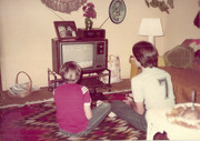 Console Living Room
 Open Library
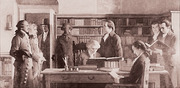 American Libraries
 TV News
 Understanding 9/11


